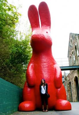
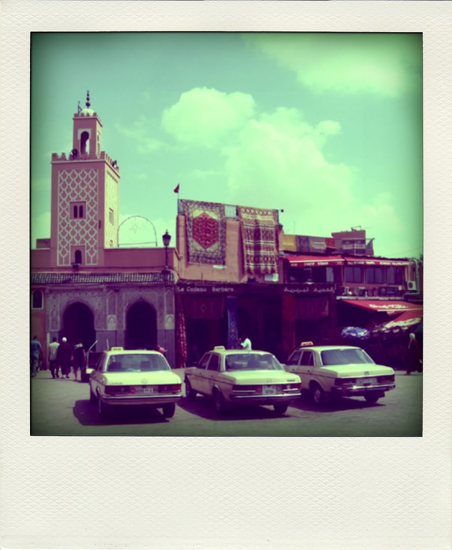
Because everyone loves the look of Polaroids, I don't have a Polaroid Camera so I make do with Poladroid! I need to wipe my memory card so I thought I'd just have a play with any nice photos I have. Yum yum!
Click to enlarge


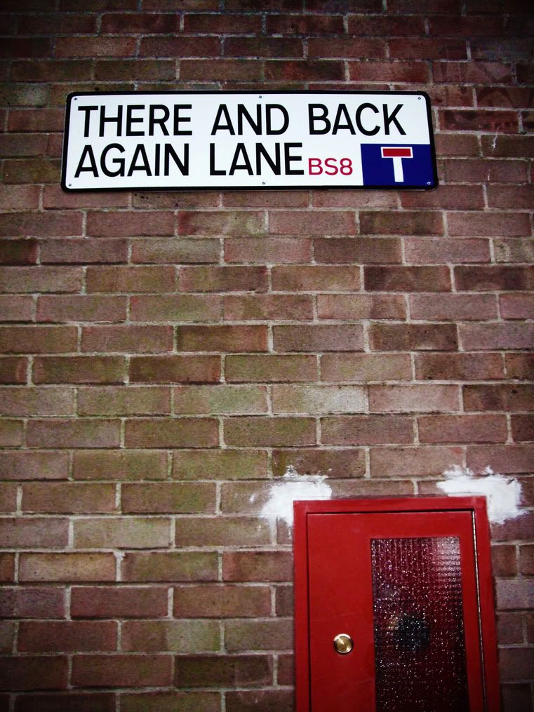
This is me!